Role: UI/UX Designer
Tools: Figma
Project Timeline: 2023 – 2023
Client: Microsoft/Compass Group
Platform: Web
PROJECT OVERVIEW
in.gredients. is a fine dining restaurant inside the Microsoft campus. I was tasked to redesign its current website to reflect a modern, minimalist, and elegant design that captures the fine-dining experience inside in.gredients..
Goals and Objectives
- Create a modern, minimalist, and elegant website redesign befitting a fine-dining restaurant.
- Implement existing color palette, typography, and logo in the website redesign.
- Ensure that the website is accessible.
style guide
design process
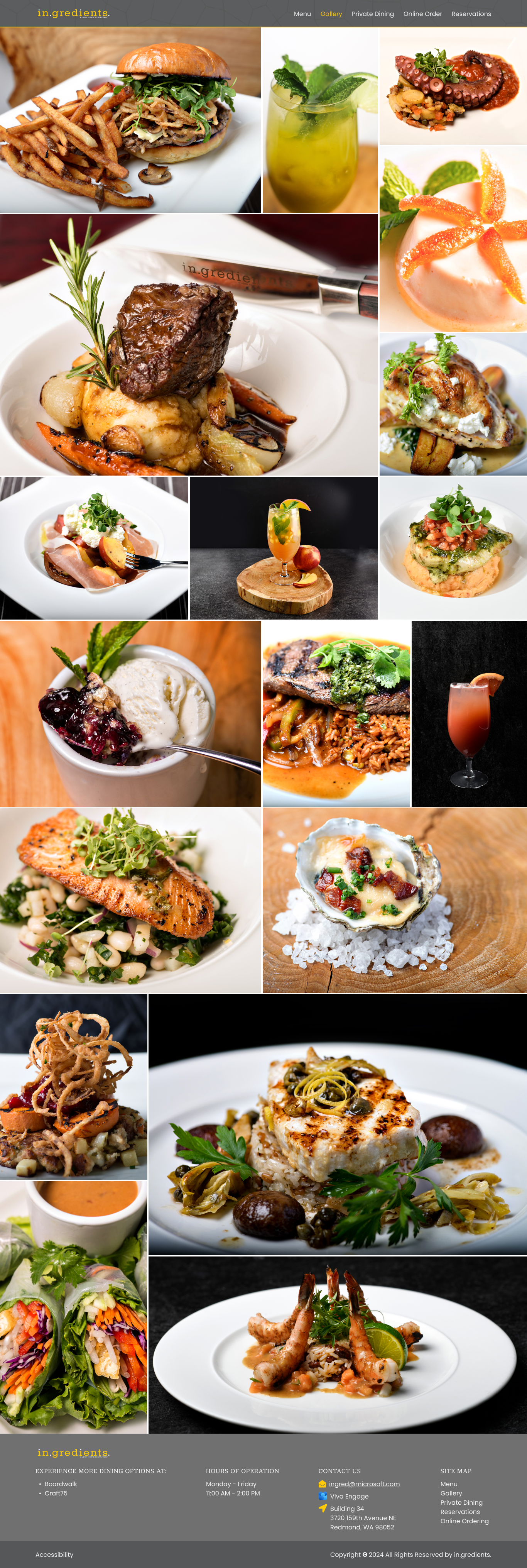
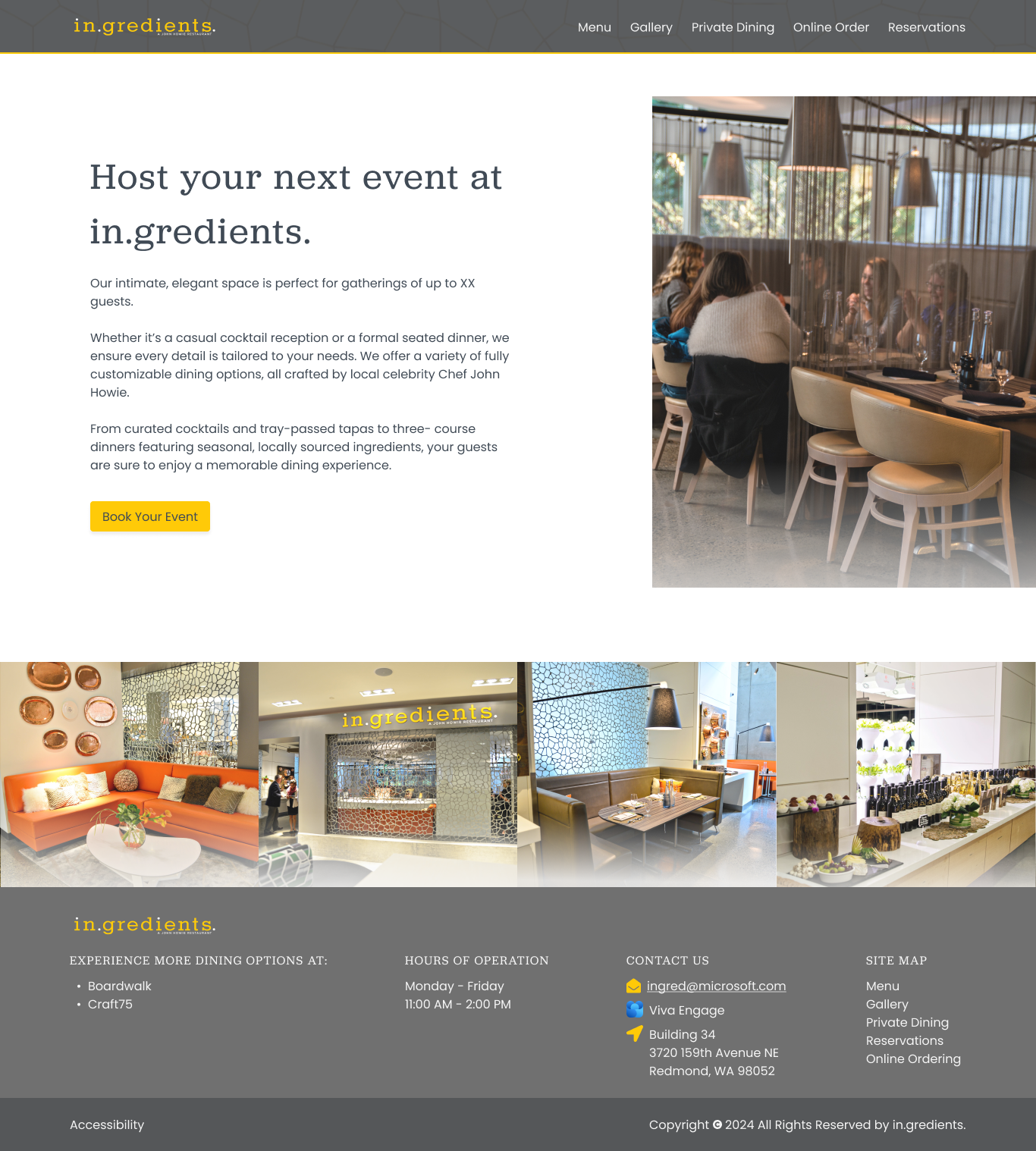
website redesign
Click here to view website prototype
how the website is redesigned
- Explore Current Website and Related Images
- I reviewed the existing website to ensure hat the redesign preserved the brand’s established identity and the familiarity valued by its users.
- I also looked at the available restaurant images to familiarize myself on its current look and feel which helped a lot in creating the redesign.
- Find Website Inspiration
- Since the clients wanted to have a clean, modern, and elegant website, I look for some fine-dining restaurant websites to draw idea and information from.
- Prototype Initial Design
- Due to tight project timelines, we began directly with a prototype, enabling the team, stakeholders, and clients to quickly visualize and experience the proposed design.
- Implement Branding
- I ensured the provided colors, typography, and logo were applied consistently across the website, helping maintain in.gredients.’ brand identity.
- Color-contrast Check
- I checked the color contrast of the text and background colors I used in the redesign with WebAIM’s contrast checker to make sure they met at least WCAG AA standards for accessibility.
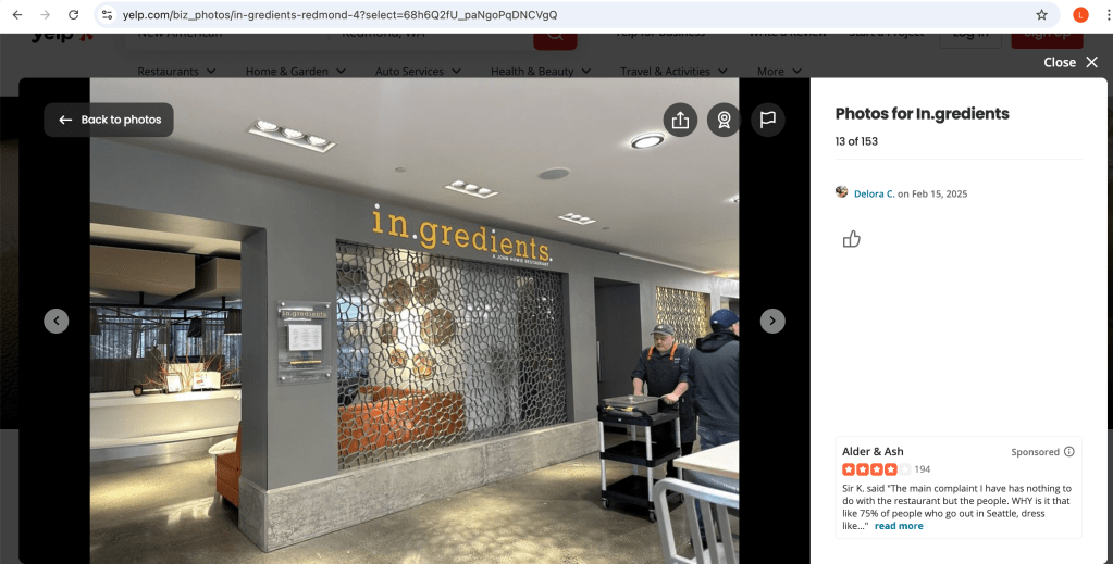
I included the whole screenshot because the image is not mine.
- Collect Images
- At first, I used images from the existing website. Later on, the clients shared a great collection of high-quality photos we could choose from. I picked the ones that best matched the redesign and helped bring the overall look together.
- For the navigation bar, my PO and I found an image that looked like the walls of the in.gredients. restaurant (please refer on the image above), so we used it as a background. This created a visual connection between the restaurant and its website.
- Iterate Based on Feedback
- After creating the prototype, I share the design to the team, stakeholders, and clients to gather insights regarding the feasibility, behaviors, and overall design and experience. After that I reiterate the design as necessary until they approve the design.
challenges and solutions
- Limited Color Options
- Since in.gredients. already had its own branding, I was limited to the existing color palette. This made accessibility trickier, so I ran color-contrast checks to make sure text and background colors had enough contrast.
- Dependency on Provided Images
- Although they provided a great set of images, it still limited my choices to those that matched the clean and minimalist look of the website. I edited some photos to maintain a consistent visual style and feel across the design.
- Technical Constraints
- Due to the limited time we had, we opted for simpler, less customized web pages to speed up development.
final thoughts
Working on the redesign of in.gredients. was truly a one-of-a-kind experience. I feel honored to have contributed to a project connected with Microsoft. I also loved working on it because it’s in the food industry, and seeing all those beautiful images of food definitely tickled my motivation to design.
I’ve always admired clean website designs, so being able to create one myself was a truly rewarding experience. It pushed me to thoughtfully lay out content and images in a cohesive way.
This project also taught me to think beyond just the website design itself but also how to unify the online and physical look and feel into a website to create meaningful experience for the users.
Overall, I met amazing people, contributed to a project related to Microsoft, designed a clean, minimalist, and elegant website the clients loved, and gained lessons that made this a truly valuable experience for me.