
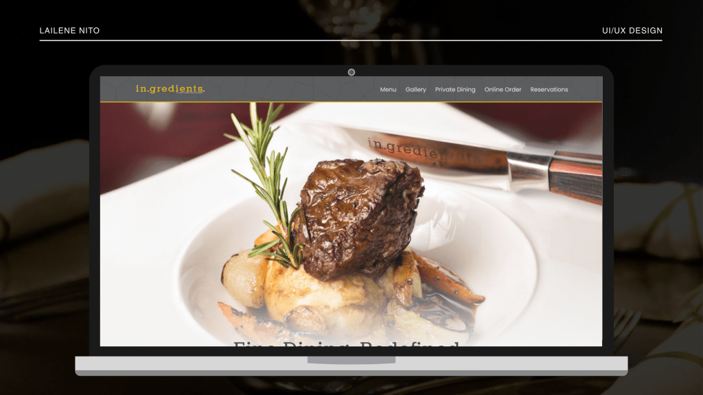
Role: UI/UX Designer
Tools: Adobe XD
Project Timeline: 2022 – 2025
Client: Passport Depot
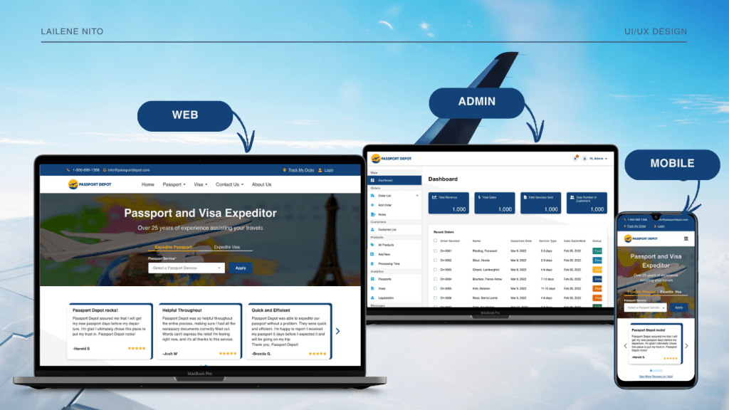
Platform: Responsive Web
PROJECT OVERVIEW
Passport Depot is a passport and website agency that has been around since 1998. The clients wanted to modernize their website to keep up with the competitors and improve the website’s overall user-experience. As a UI/UX designer, I was tasked to do the redesign of the website.
Goals and Objectives
- Redesign the website to be clean, modern, professional, and user-friendly.
- Simplify passport and visa request process that allows the customers to submit service requests, pay, and track orders directly on the website.
- Ensure that the website is responsive on web and mobile view.
- Ensure that the website comply with accessibility standards.
- Create an admin interface where the Passport Depot admin can view and create orders, and manage their services.
style guide
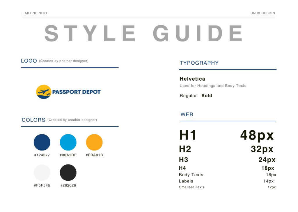
another designer.
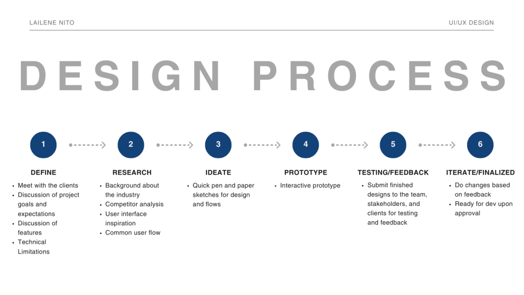
design process
quick design throwback


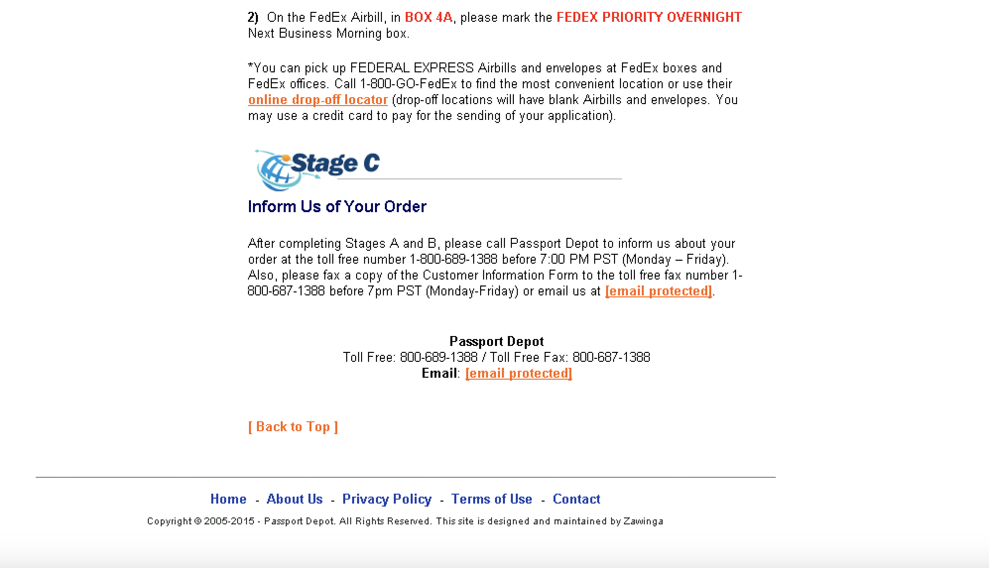
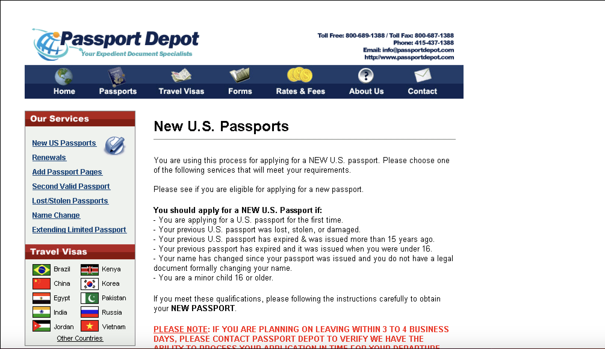
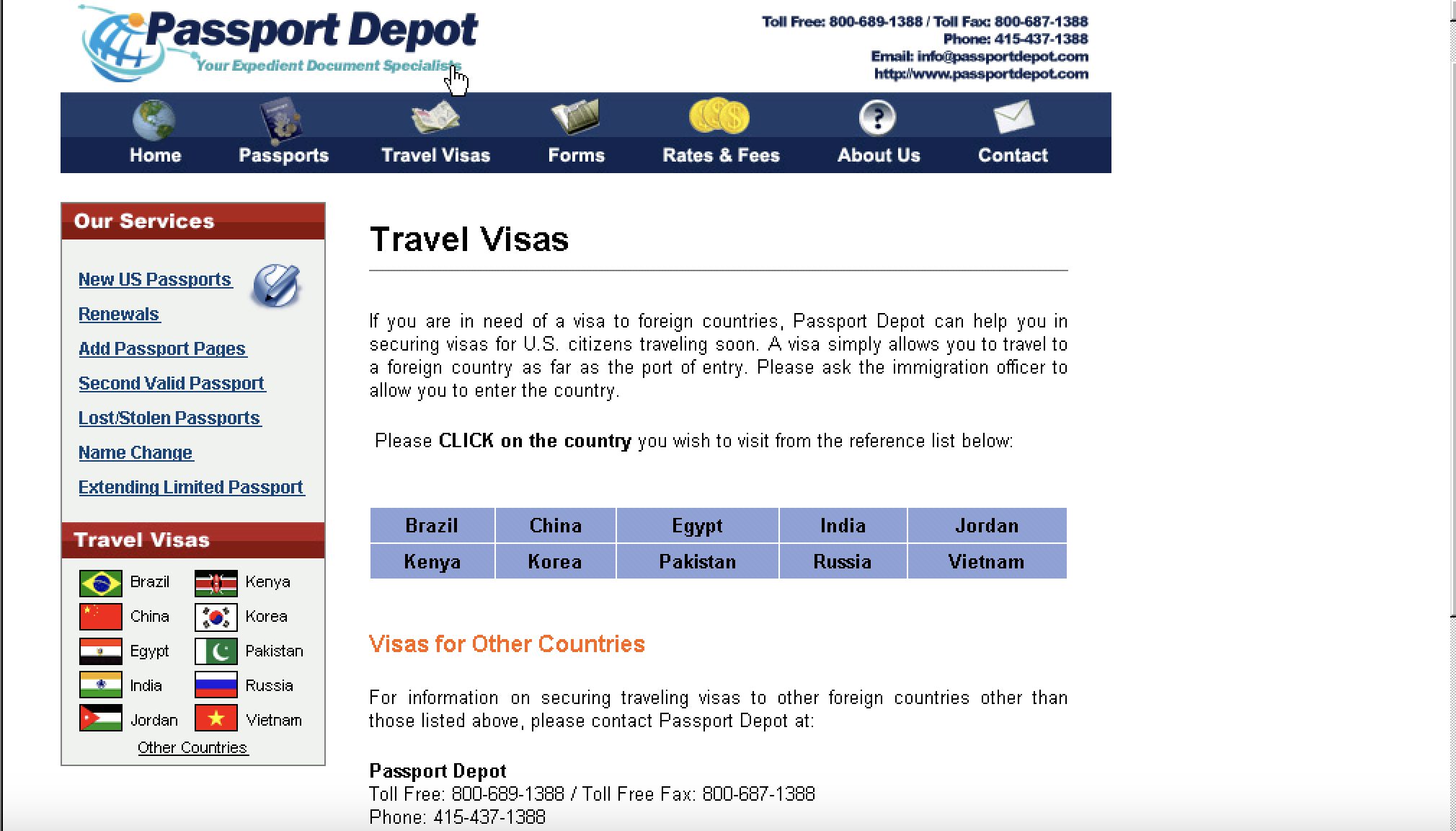
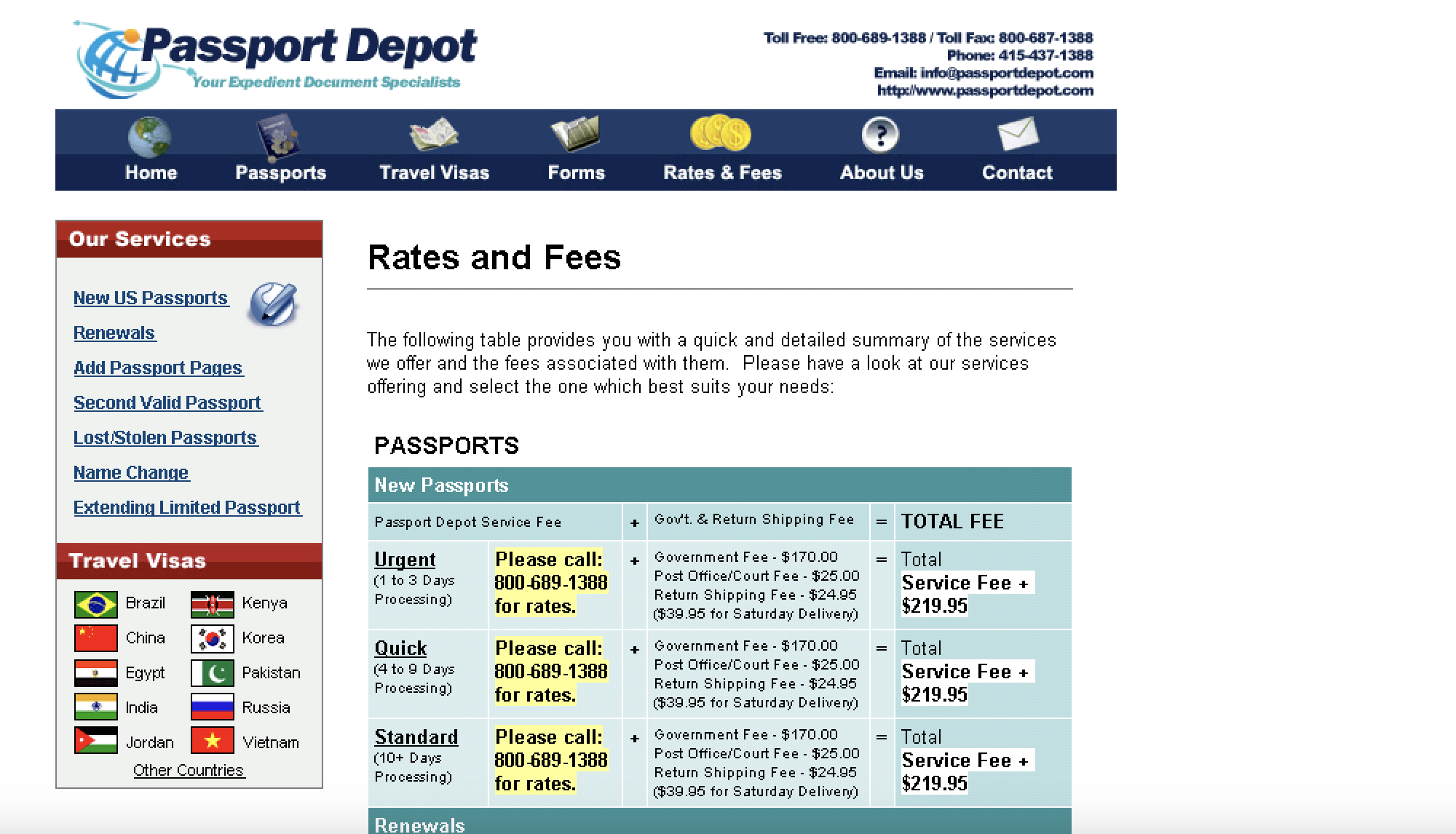
Before the redesign the following are the usability issues that were found:
- Outdated website design
- UI is text heavy
- Some texts have poor contrast against the background
- The UI looks cluttered and lacked visual hierarchy
- Inconsistent component behavior
- Redundant contents
competitor analysis
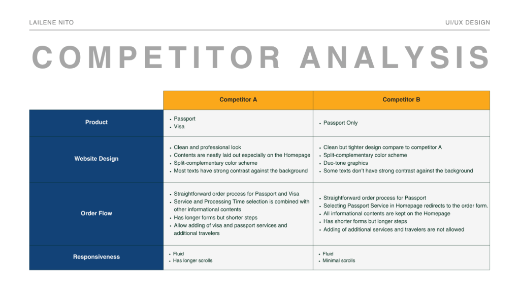
Key Takeaways
Product: Competitor A offers more services (Visa) compared to Competitor B.
Website Design: Split-complementary colors (Blue as base) were both used by the competitors. Both also have clean interfaces but have different approaches in terms of layout and spacing. Lastly, Competitor B, has texts with low contrast against the background.
Order Flow: Though both competitors have straightforward approaches in their order flow, each one has a different approach on handling their forms and in terms of flexibility.
Responsiveness: Both competitors showed great responsive design (mobile), however, due to their different approach in terms of content and layout, Competitor A has longer scrolling compared to Competitor B.
The findings above helped in shaping the overall look and feel of the Passport Depot website. Taking the good points from the two competitors provided a clear starting point for the redesign like in the area of aesthetic, and for the order flow. On the other hand, there are also potential improvements where the new Passport Depot can do better, like the text contrast against the background.
The competitor analysis above is not only for benchmarking but also for Passport Depot to address the gaps the competitors missed.
Website redesign
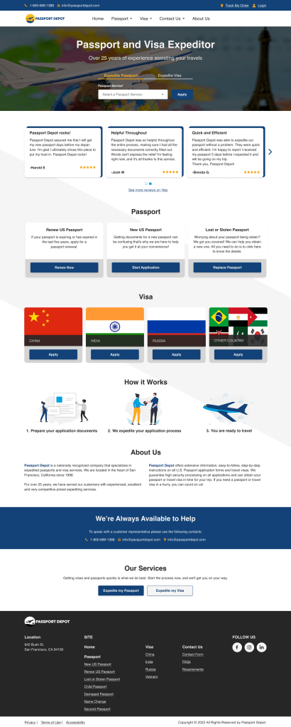
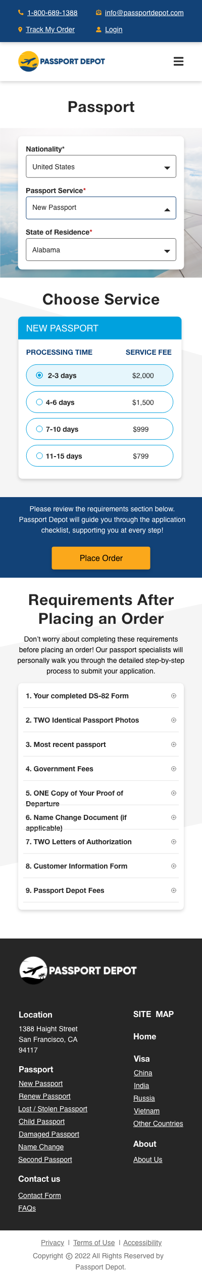
Passport Depot Homepage
- The Homepage is designed with a clean aesthetic in mind, ensuring that elements have enough breathing space so that it doesn’t look cluttered.
- Ensured that the text and background has enough contrast making it readable for the users.
- Kept the navigation simple to help users effortlessly move throughout the site.
- Placed service options in the first fold of the website to increase visibility and allow new and returning users to easily apply.
- Included call-to-action buttons in key sections, allowing users to apply easily even if they decide mid-scroll.

Click here to view website prototype
Please be informed that the design above is recreated from XD to Figma and is work in progress, including some behaviors of the components.
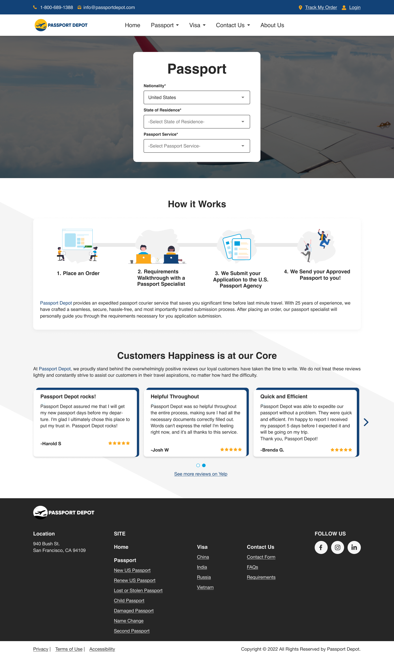
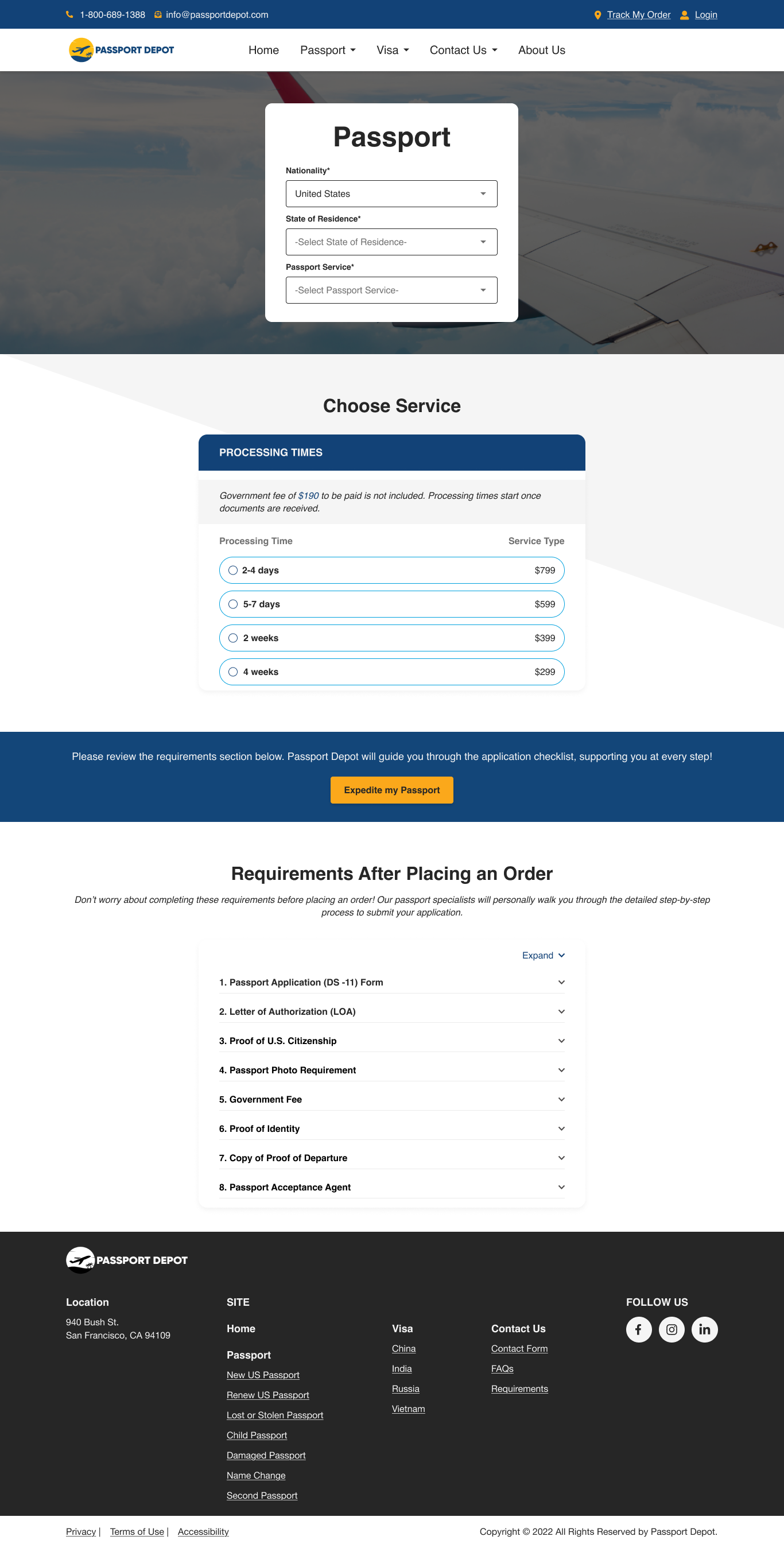
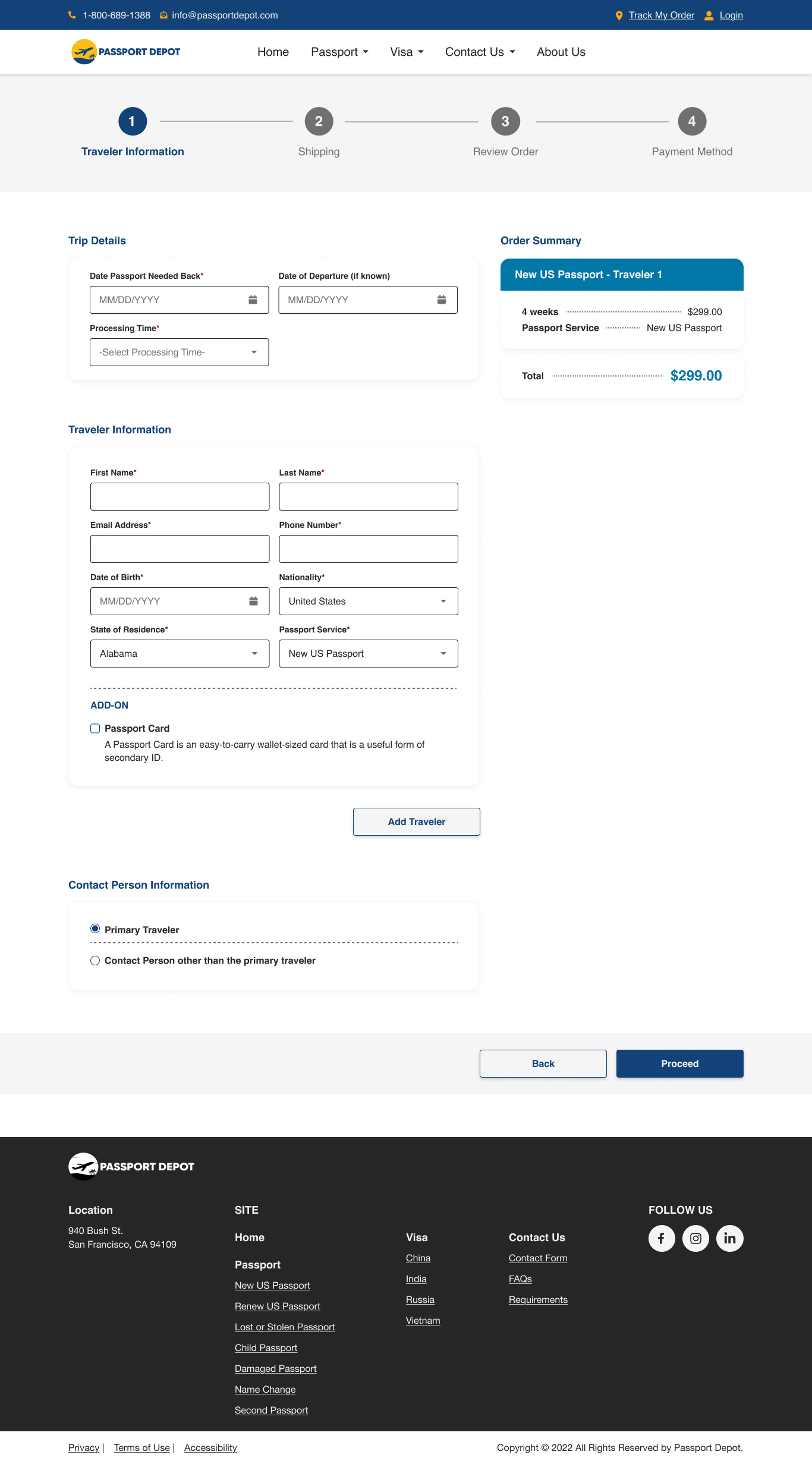
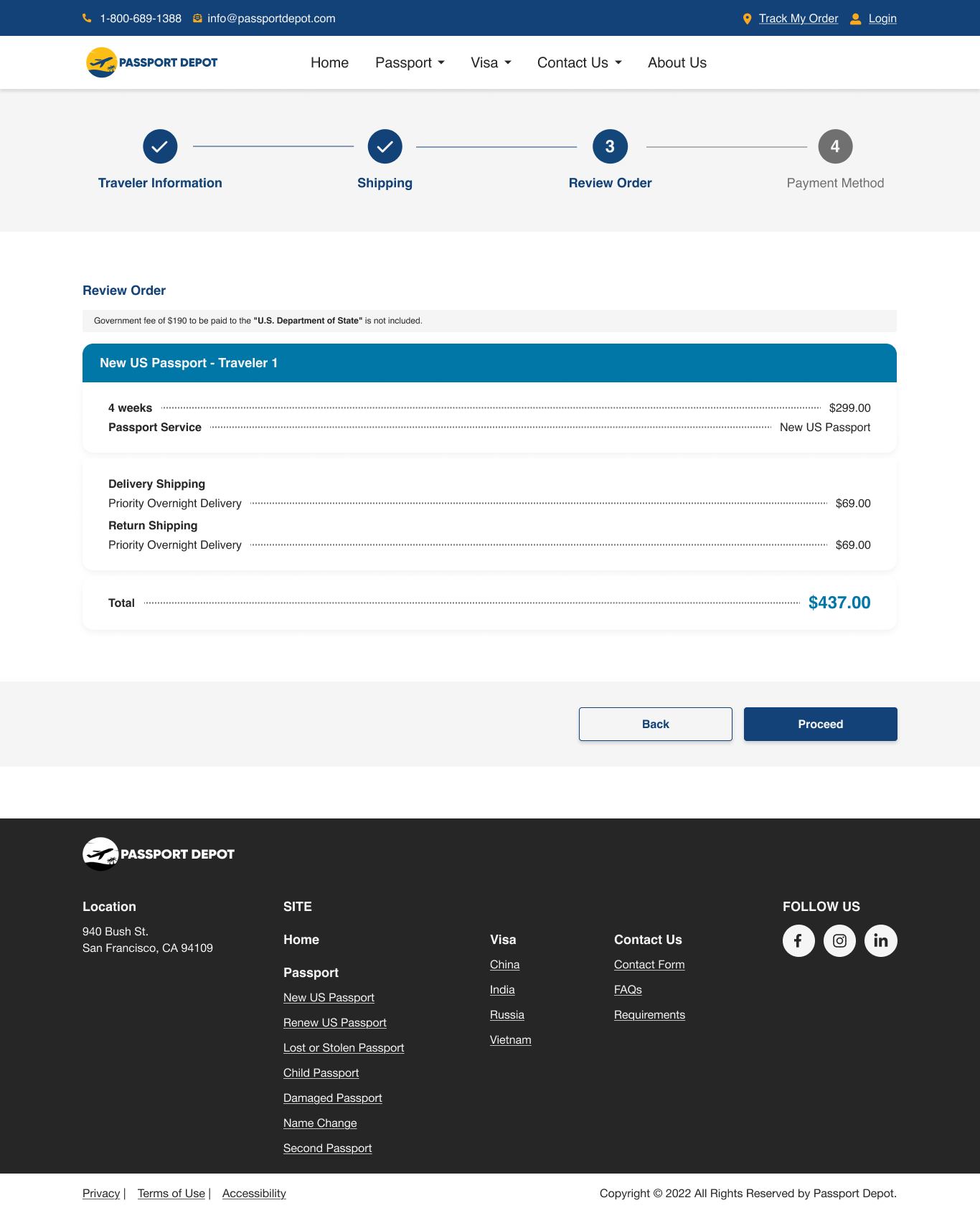
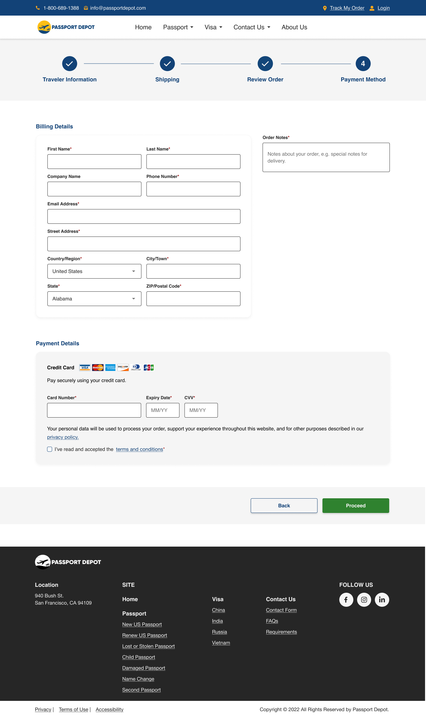
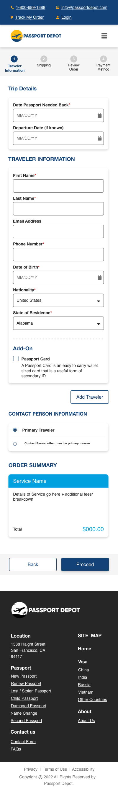
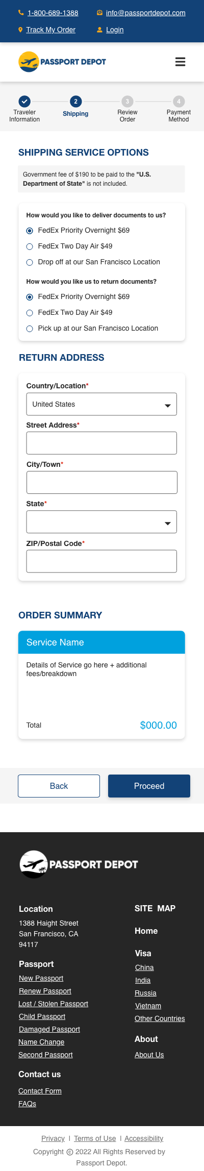
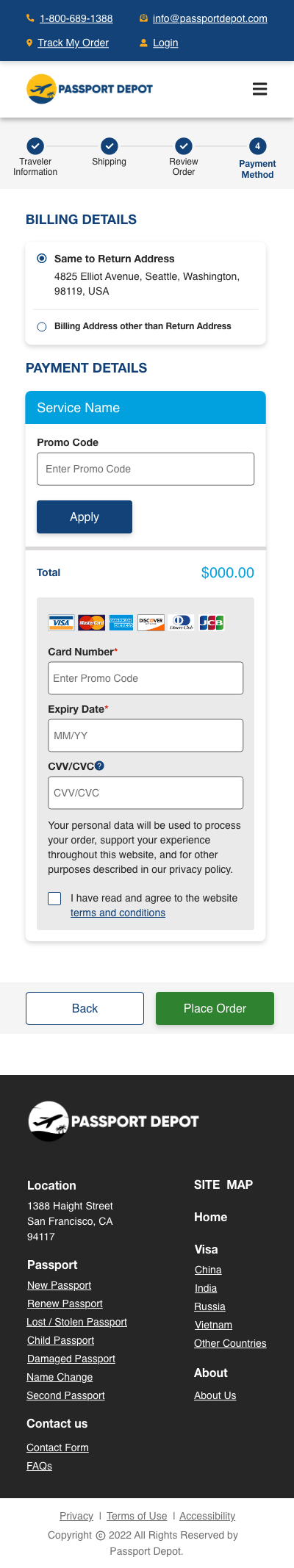
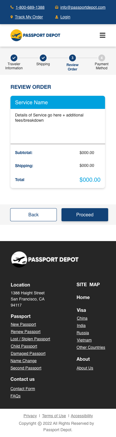
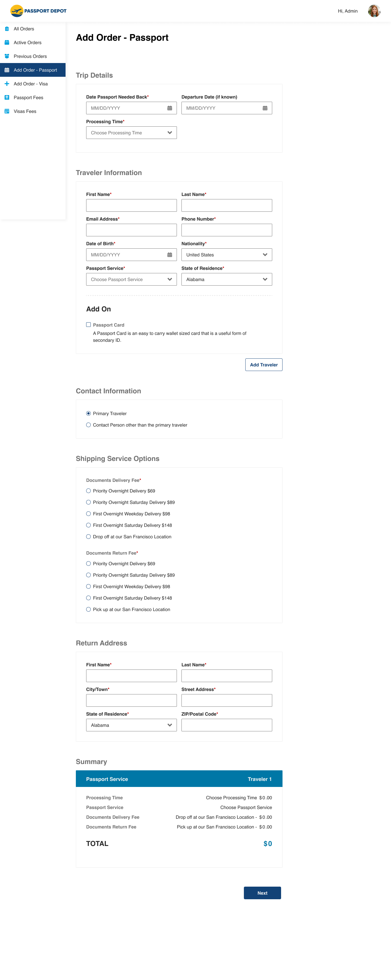
Order process
- Analyzed common patterns shared by competitors from required fields to implemented order process flow, this helped in making informed initial design decisions, since the team needed to start despite there were key requirements missing.
- Gather clients (who have been running the business for years) insight about the overall structure of the form. This helped in making sure that the form and process have the necessary fields required and steps for a user to complete the order.
- Made sure that the users were guided during their journey by providing progress stepper, required fields indicator, form titles, order summary, and clear button labels.
- Considered the current limitation of the form plugin. Some fields used in the form have limited customizations available therefore it’s decided to keep its native state.
- Due to the tight timeline, nice-to-have things were reserved for later, like customizations of the form elements, especially if it will take a lot of time to do.
- Kept the form simple to help with the responsiveness of the site and reduce dev time.
Mobile responsive Design

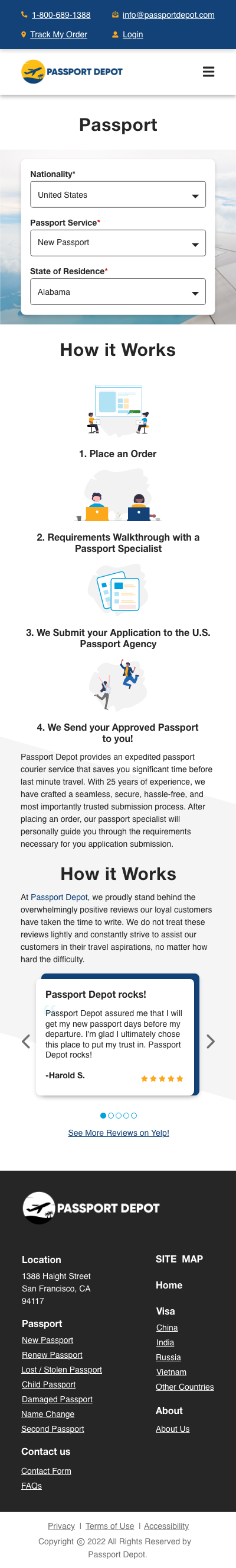
Click here to view responsive mobile prototype
Please be informed that the design above is the initial mobile responsive design in Adobe XD and some web updates might not be reflected.
order process mobile responsive
- Adjusted the layout, sizes, and approach on some elements like the navigation menu and dropdowns to make sure that it adapts on the screen sizes we’re aiming for.
- Though we focused on doing the mobile responsive with a 400px width, as the team tested across different devices, we also made necessary adjustments to ensure that the elements are not broken.
admin design
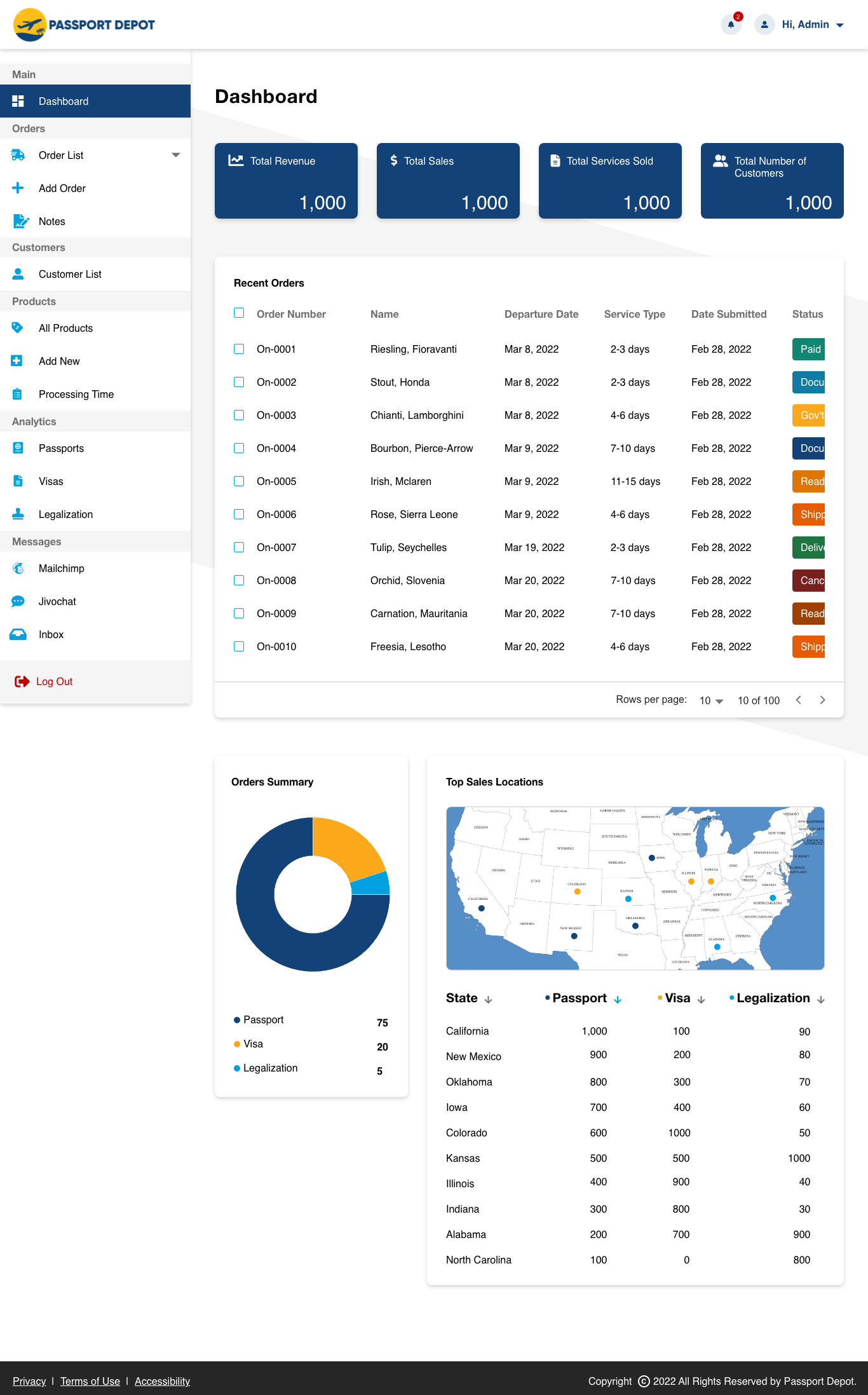
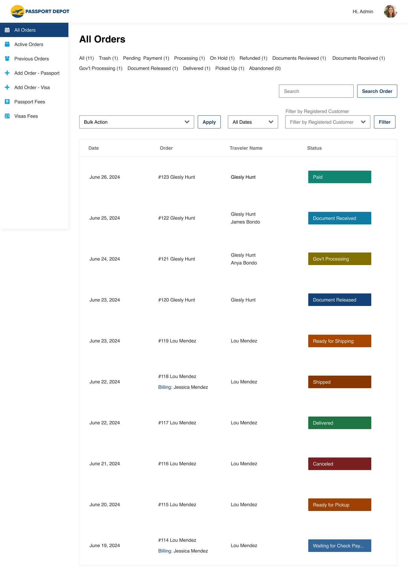
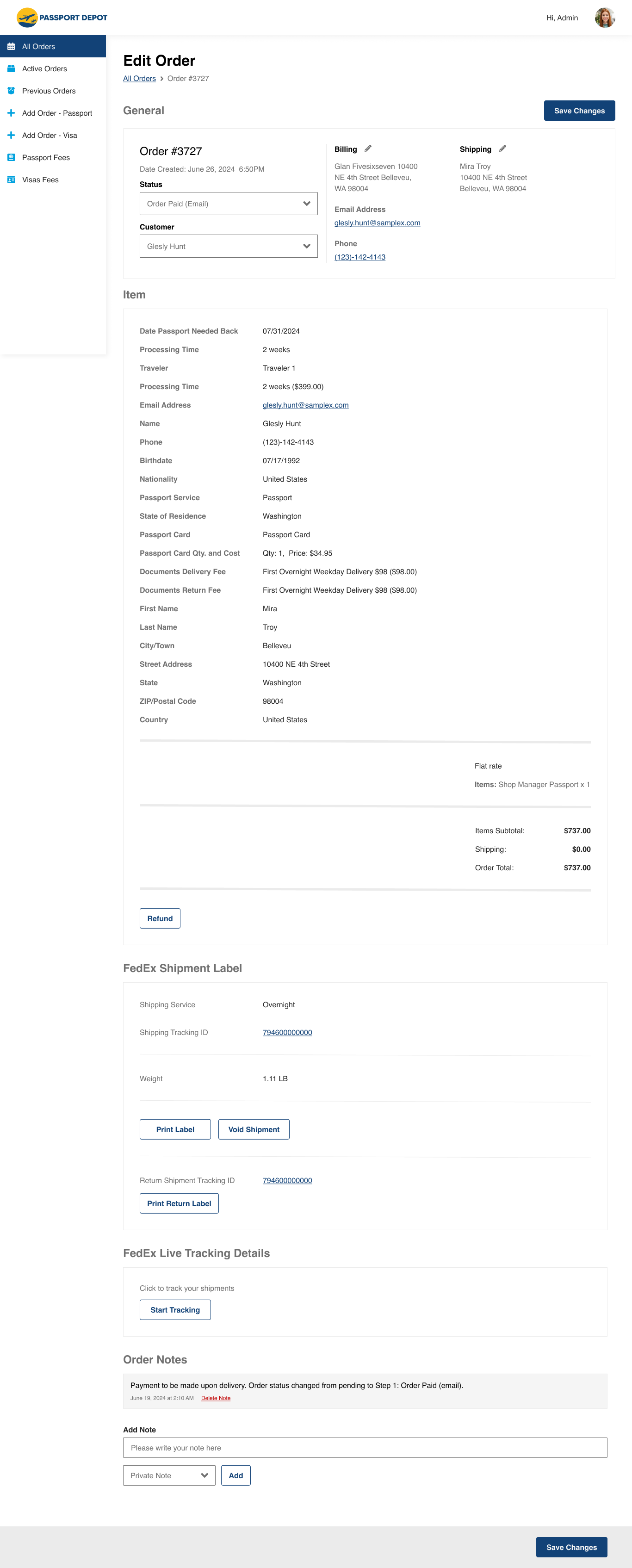
Click here to view admin dashboard prototype
Please be informed that the design above is recreated from XD to Figma and is work in progress, including some behaviors of the components.
admin dashboard
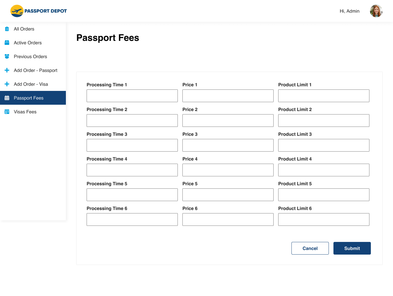
- Gathered insights and designed based on the clients needs, since it will be directly used and managed by the clients, the team and I made sure that they are heard about the experience that they are expecting as well as what are the needed features they would like to have.
- Designed based on available customizations for the plugin to minimize possible errors caused by customizations.
final thoughts
When I first saw the old website, it was easy to tell that it looked outdated, especially compared to websites today. That made sense since it hasn’t been updated in years. Despite that, I could feel that the old site already had its own “soul.” You can see the original vision and goal of the client when they first started the business.
It was clear that they wanted to make things easier for their users. The navigation was easy to find, and they made sure to include all the important information, like forms, requirements, and the steps in the process.
The decision to redesign the website shows their continued commitment to improving user experience. One of the biggest changes was simplifying the application process, and I’m grateful I had the opportunity to contribute to that.
Although the redesign received positive feedback from the client, I believe the result could have been even better if we had gathered insights directly from their customers. Knowing what users expect, what they find frustrating or helpful, and how they interact with the site would have given us clearer direction, not just to meet industry standards, but to elevate the experience beyond that.
Since we mostly relied on competitor research, I think there’s still a big opportunity to make something even better through actual user insights.
Overall, I really enjoyed working on this project. The client was generous with their feedback and always open to collaborations, which helped not just me but the whole team understand things better and move in the right direction.
Designing for a WordPress site also taught me a lot, especially about working within the constraints of plugins, where even small changes can impact functionality. Starting with desktop-first design challenged me to think about how layouts scale down, and implementing accessibility gave me valuable experience in inclusive design, an area I’m continuing to grow in.
 Lailene UI/UX Design